Retrace · B2B SaaS · Shipped
Assigning Electronic Remittance Advice to the correct clinic
The AI placed 96% of incoming files on its own. I designed the tool people use for the other 4%.
Problem
Retrace's AI matched 96% of ERAs to the right clinic. The remaining 4% needed a person, and at this volume those files put roughly $1 million in payments at risk of landing in the wrong place.
What I designed
An expandable review table that shows the AI's confidence for every candidate clinic, so staff can bulk-assign the files it's sure about and investigate the ones it isn't, without leaving the list.
What changed
Shipped to Retrace support and partner practices. High-confidence files are cleared in one action. Low-confidence files are resolved in place, with the evidence side by side.
I'm not quoting an efficiency percentage here. We didn't baseline the old workflow, so the last section covers how I'd measure it.
Quick look
The shipped flow in under a minute
Context
Where an ERA comes from
Retrace is a billing platform for dental practices. After a treatment, it creates the insurance claim and sends it out. An Electronic Remittance Advice (ERA) is what comes back: the payer's statement of what it paid, for which claims.
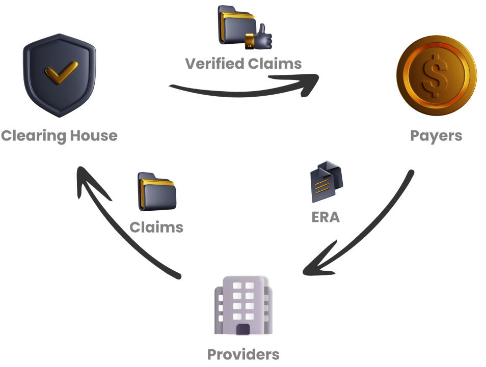
1 · Provider
Retrace generates the claim when treatment is complete and sends it to a clearinghouse.
2 · Clearinghouse
Checks the claim against the required standards, then forwards it to the insurance payer.
3 · Payer
Processes the claim and sends an ERA back to the provider.
The catch is step 3. One ERA can cover several claims, and it doesn't always say which clinic it belongs to. For a practice group that runs many locations, with the same patients and providers appearing at more than one, that is a real question.
The hand-off
The AI handles most of it. People handle what's left.
Four percent of 5,000 is around 200 files a month that someone has to open, read, and place. The design problem was that queue.
Research
How do people decide where a file belongs?
I talked with front-desk coordinators at dental clinics and with Retrace's customer support team, and asked them to walk me through matching a file by hand. I wanted to know two things: which pieces of information they trust, and where the process breaks.
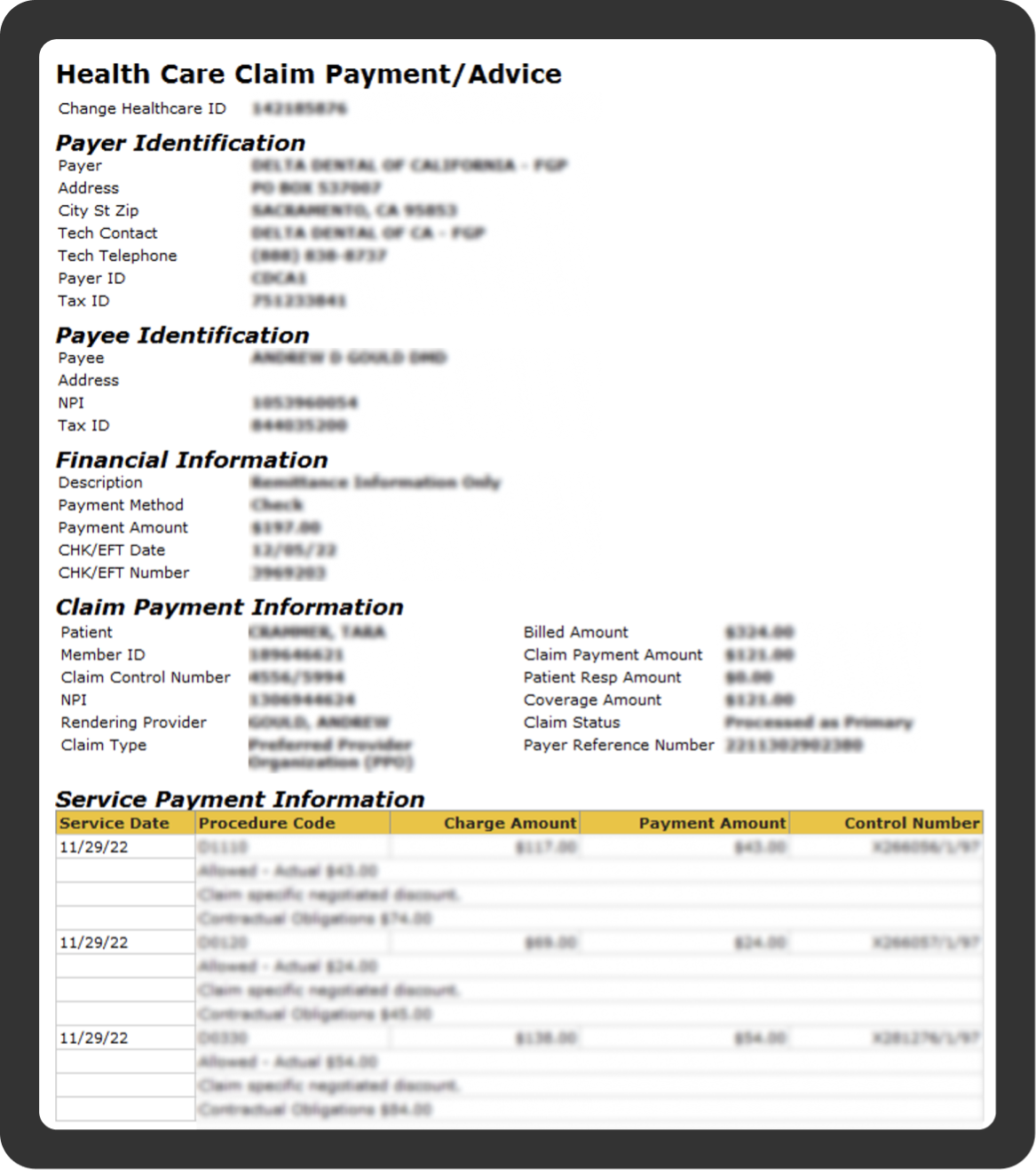
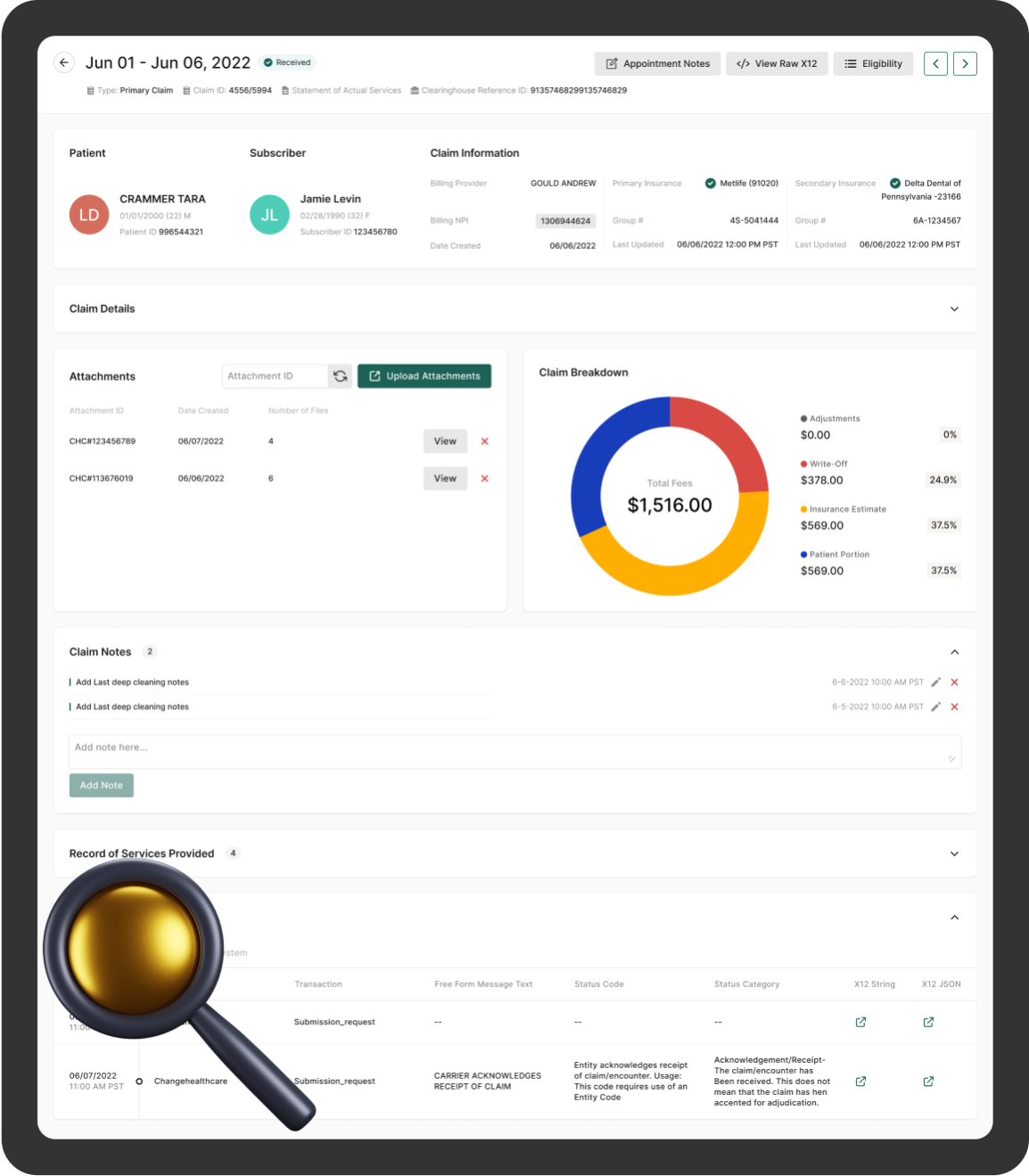
The five fields they check, in order
- Patient name
- Provider name / NPI
- Billing NPI
- Billed amount
- Service
This list became the column order and the highlight logic in the final table. If people already scan in this sequence, the interface should present the evidence in this sequence.
Where it broke down
Cross-clinic patients
The same patient name shows up at more than one clinic, so a name match alone settles nothing.
Multi-clinic providers
Providers work across locations too. The NPI narrows it down without closing it.
Unreliable claim IDs
Data errors mean the claim ID on the ERA can't be taken at face value.
Redundant files
Duplicate ERAs sit in the headquarters queue with no easy way to spot and clear them.
The first three share a cause: no single field is decisive. People were weighing several fields against each other in their heads, file by file. The AI makes the same comparison and can express it as a confidence score. The design question became how to put that score to work.
Design direction
Three principles before any layout
01
Surface the evidence
Highlight the five identifying fields so the eye lands on what decides the match.
02
Compare in one view
Put ERA details next to candidate claims. No tab-switching, no remembering numbers.
03
Let confidence set the effort
Show the AI's score per clinic. High score, quick approval. Low score, closer look.
Explorations
Three ways to lay out the review
Option 1
Drawer
A side panel that collects every unmatched ERA in one focused list.
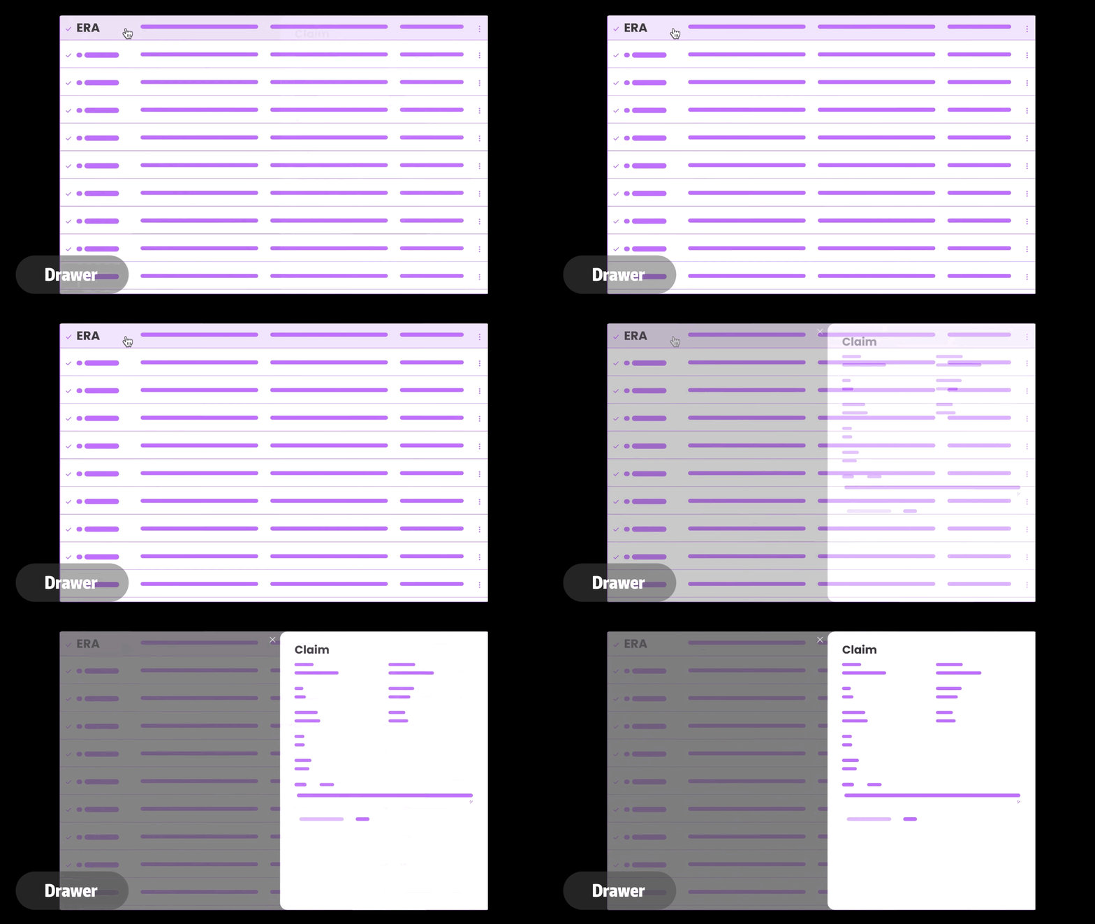
Why I moved on. A drawer is a long single-column list. With a couple of hundred files, I expected the middle of that list to get the least attention, and the narrow width left no room to compare an ERA against claims.
Not pursuedOption 2
Side-by-side ERA image
Show the original remittance document next to the claim so people can read both.
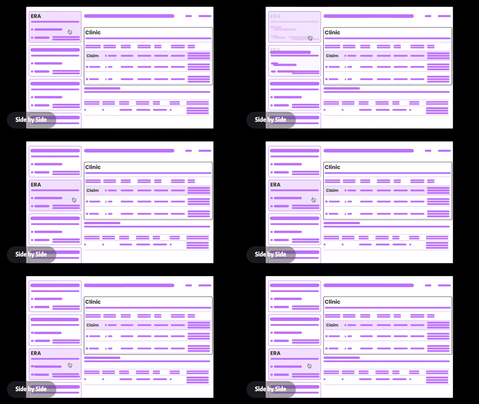
Why I moved on. It's good for a careful visual check. But it depends on document quality we don't control, and reading two full documents per file is too much effort at 5,000 a month.
Not pursuedOption 3
Expandable table
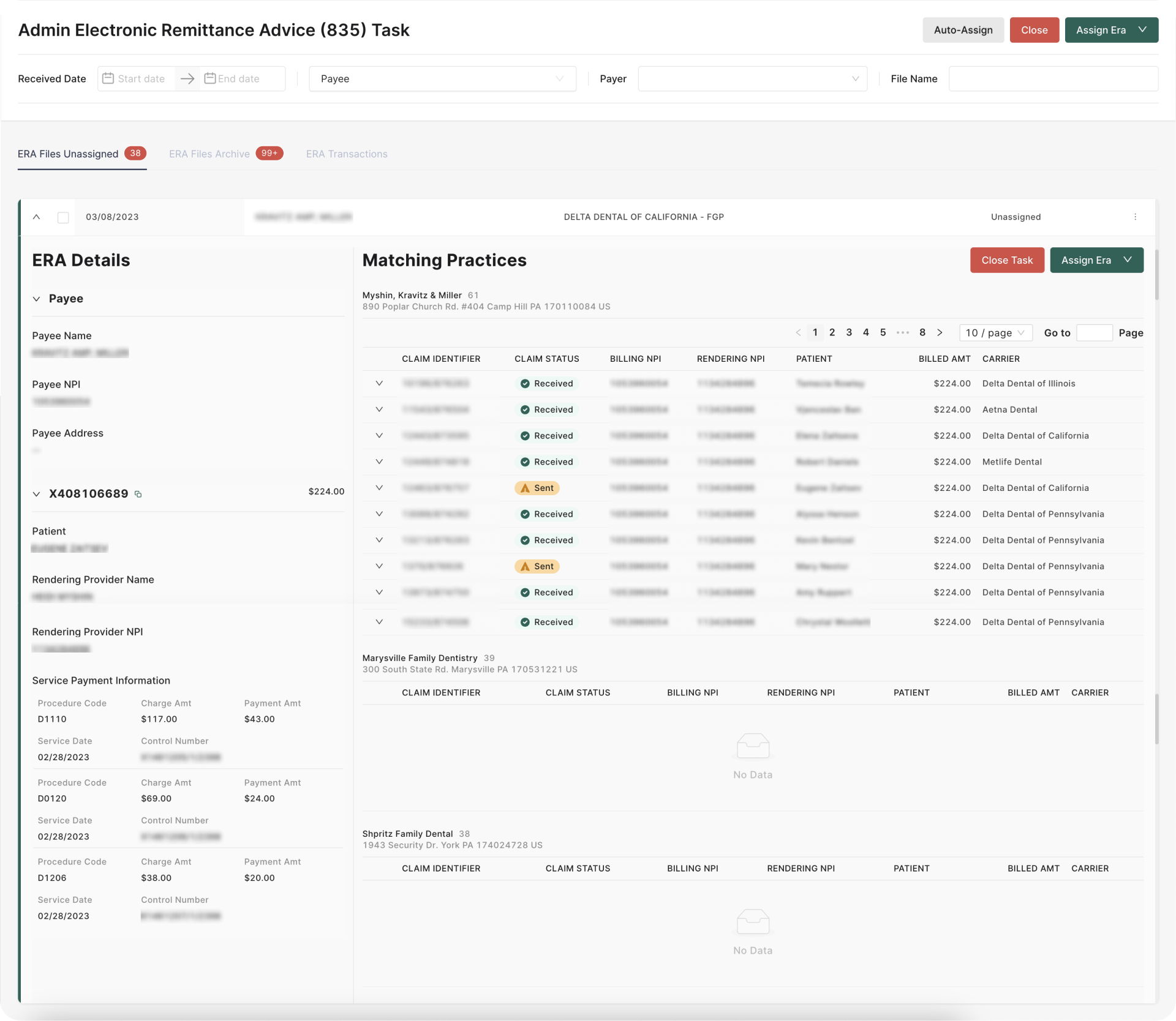
Every unmatched ERA is one row. Expanding a row reveals ERA details and candidate clinics together.
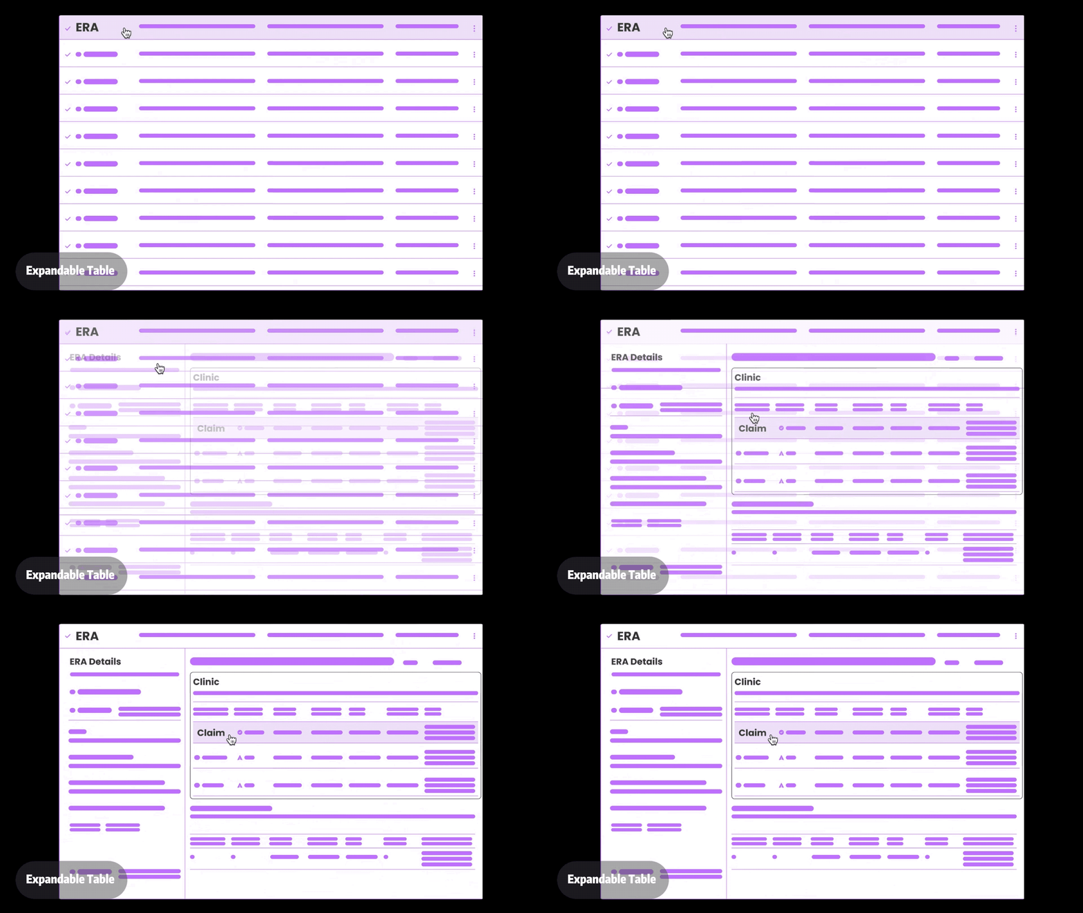
Why this one. The collapsed state supports scanning and bulk action. The expanded state supports comparison. People only pay the cost of detail for the files that need it. The trade-off: the expand affordance has to be obvious, and engineering flagged it as the most demanding of the three to build.
ChosenFinal design
Two flows, split by how sure the AI is
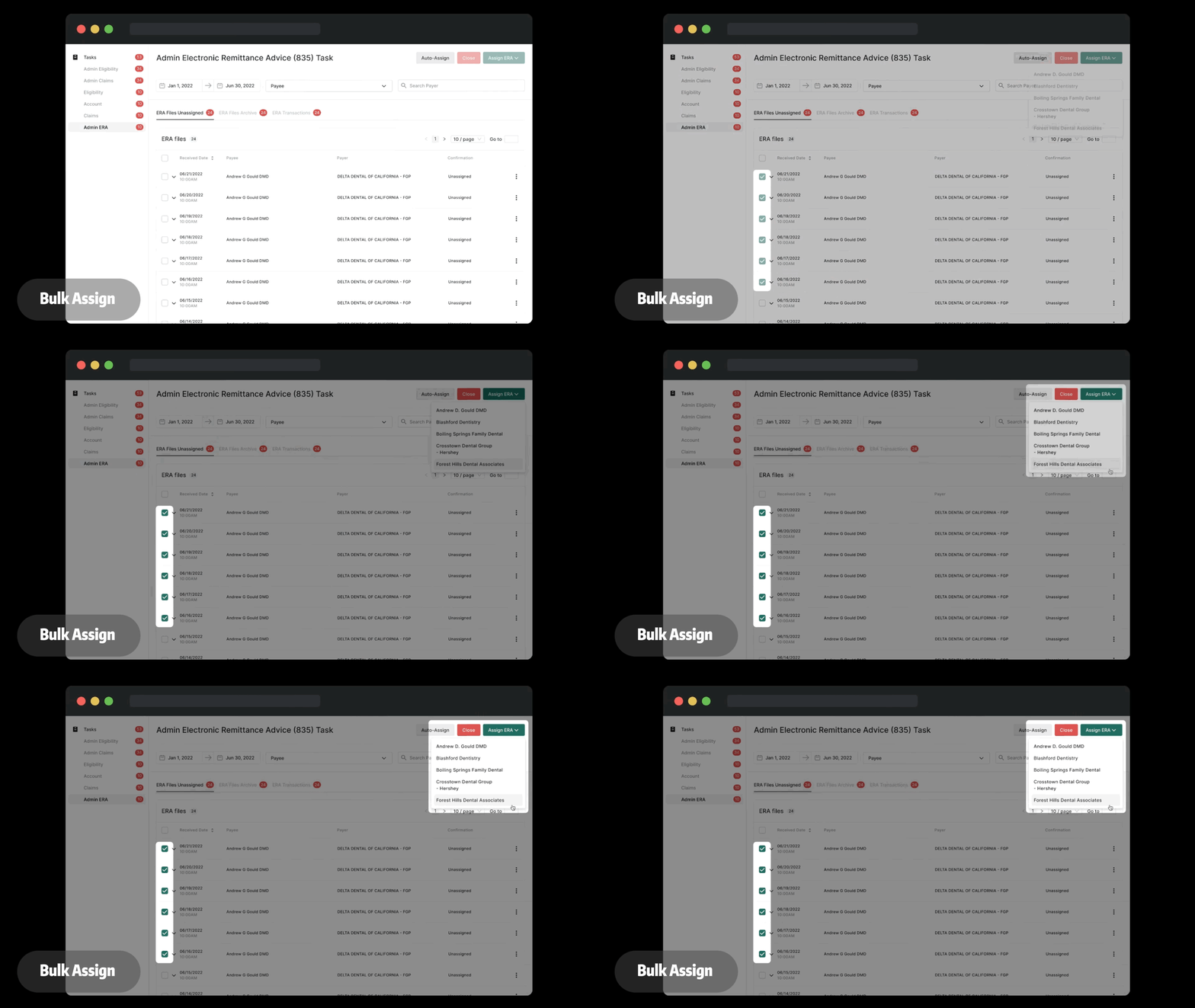
Flow 1 · Bulk assign, for high-confidence files
When the AI's top candidate scores high, the row shows the suggested clinic up front. Staff select the rows they agree with and assign them in one action, without expanding anything.
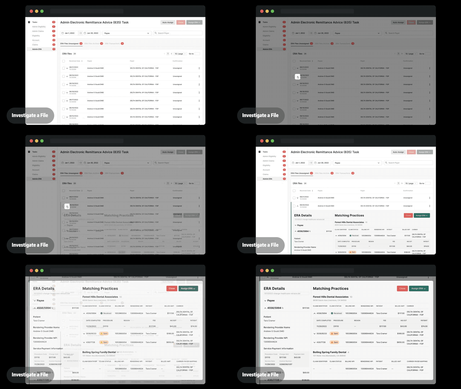
Flow 2 · Investigate, for low-confidence files
Clicking a row expands it into two panels. On the left, the ERA details: payer, patient, rendering provider, service lines. On the right, the candidate practices with their claims, so the five fields can be checked against each other directly.
Each pain point, and what answers it
| What people struggled with | What the design does about it |
|---|---|
| Same patient at several clinics | The expanded row lists every candidate practice with its claims, so the tie is broken by provider, amount and service, not by name. |
| Same provider at several clinics | Confidence scores rank the candidates. The likeliest clinic is suggested first, and the others stay one glance away. |
| Claim IDs that can't be trusted | The claim ID is one field among several. Comparing ERA and claim details side by side catches the mismatch. |
| Duplicate ERA files | Filters by payer, date and file name bring duplicates together. Multi-select clears them in one pass. |
Validation & iteration
What feedback changed
I reviewed the three options with product, engineering, customer support and sales. Product shaped the goals. Engineering judged the expandable table harder to build but the most adaptable. Support and sales brought what they were hearing from clinics.
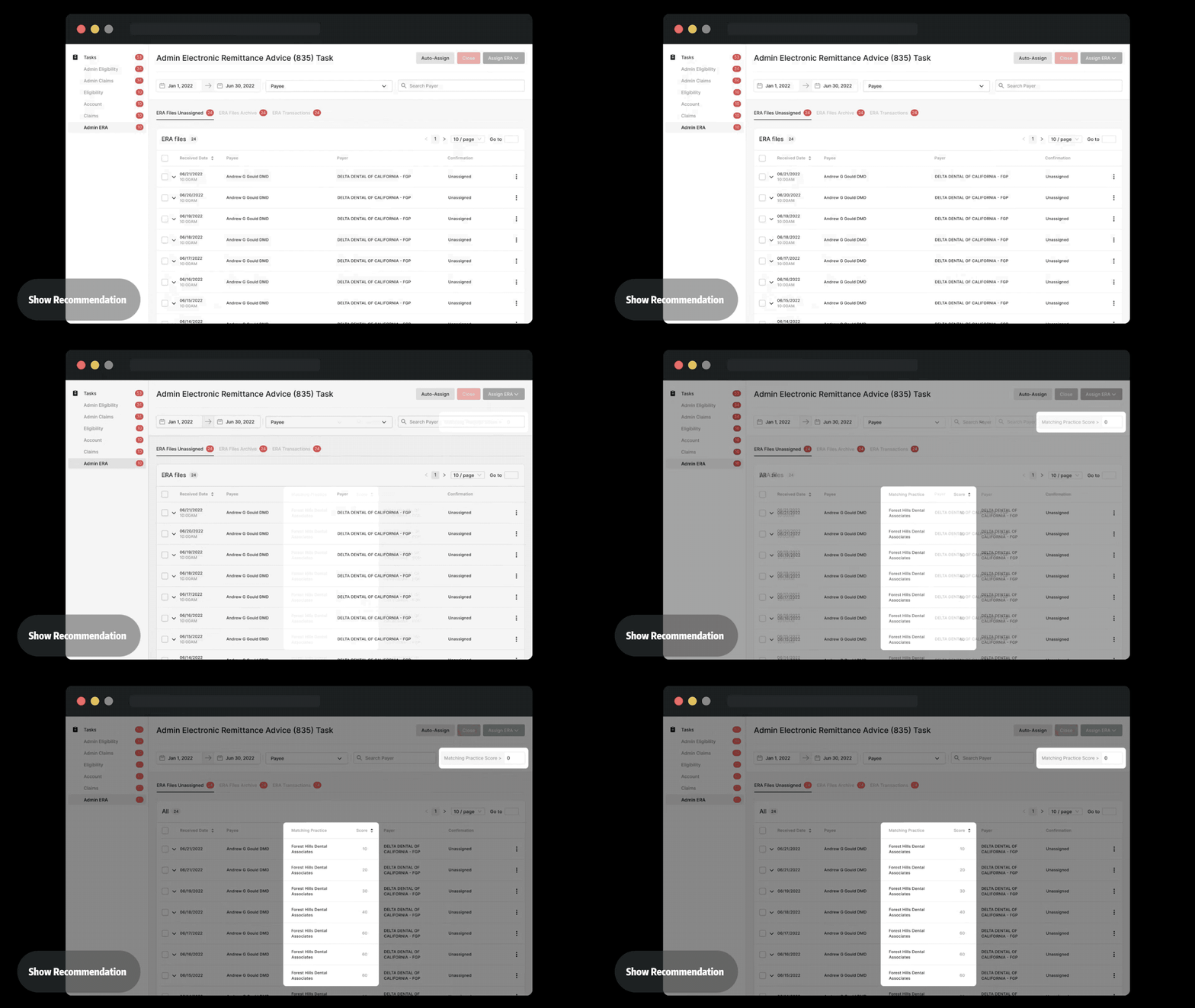
User feedback then changed the table itself. I brought the matching practice and its score forward into the collapsed row, so the AI's best guess is visible without opening the file. Once the recommendation was on the row, bulk assign was the natural next step, and we added it.
“This product has been an absolute lifesaver for our clinic, as it effortlessly solves the ERA matching challenge and simplifies the process of navigating through ERA to correct clinics.”
Measuring it
How I'd measure success
We shipped without baselining the old workflow, so I can describe what changed but can't put an honest number on it. If I were setting this up again, these are the signals I'd instrument before launch.
| Signal | What it tells us |
|---|---|
| Median time from “unassigned” to “assigned” | Whether the queue is moving faster, per file and overall. |
| Share of files assigned in bulk | Whether people trust the confidence score enough to act on it. |
| Reassignment rate | How often a file is moved after assignment. This is the real error rate, for bulk and manual separately. |
| Escalation rate to coordinators | Whether support can now resolve files that used to be handed to the clinic. |
| Age of the oldest unassigned file | Whether hard cases are being worked or quietly avoided. |
Reflection
What I'd do differently
Test with coordinators before build
I drafted a test plan covering efficiency, precision, ease of use and duplicate detection, but the layout itself was chosen in internal review. Next time I'd run that plan with coordinators on a prototype first.
Decide what “high confidence” means
Bulk assign is only as safe as the threshold behind it. That number deserves its own study: where does the reassignment rate start to climb?
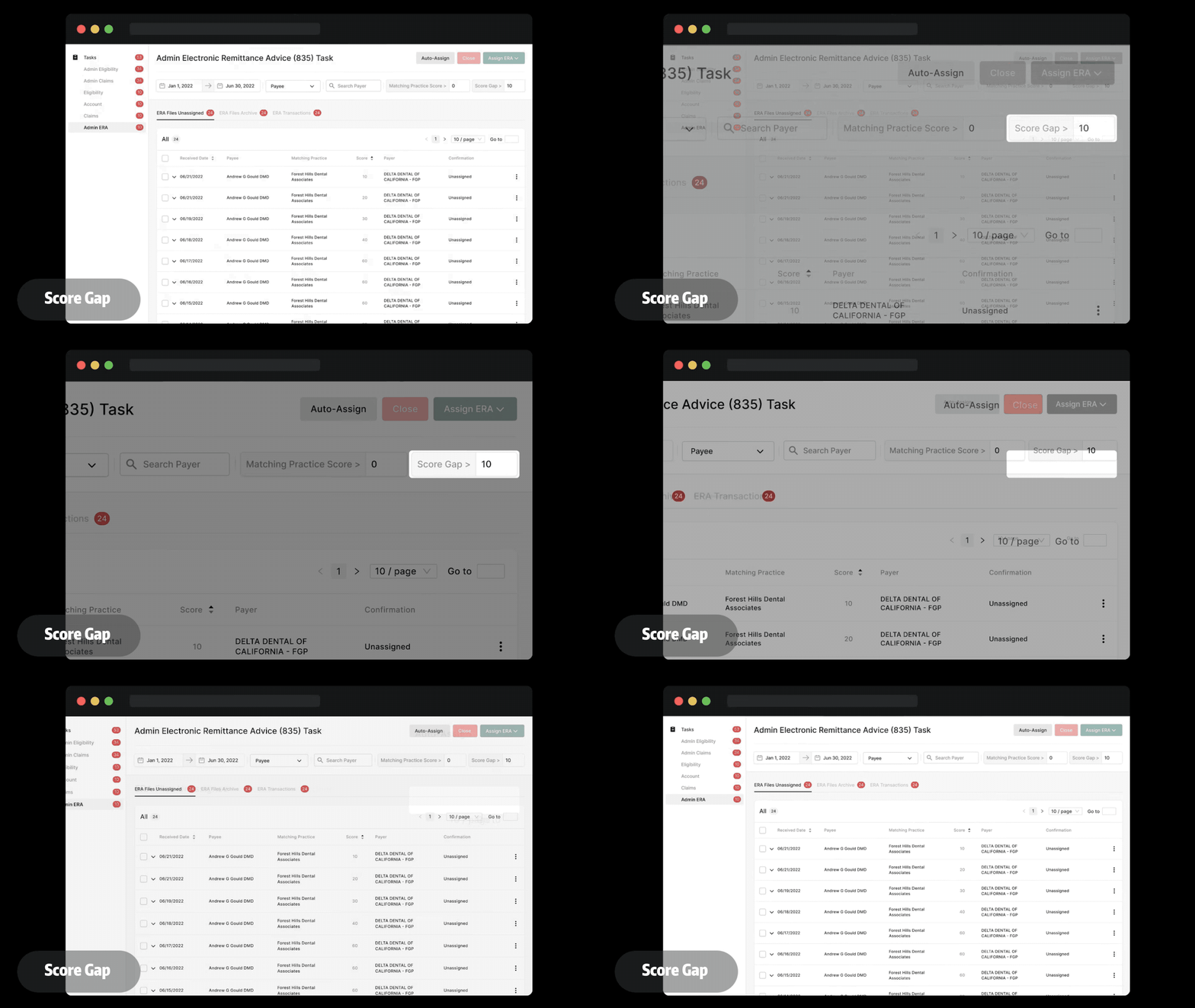
Next step: filter by score gap
A top score of 80 means something different when the runner-up is 78 than when it's 20. Showing the gap between the first and second candidate, and letting people filter on it, would separate the clear calls from the close ones and let each team set its own tolerance.